'Color is only beautiful when it means something'
A little inspo from Robert Henri, Severance set design, and why you should know your clients color analysis.
Good Morning! Probably a little late to the game but…we started watching Severance this week and were immediately enamored by the opening scene. Like whattt are these colors! The set design is really really good and a lot of thought clearly went into every physical choice — A woman wakes up at a curved table, its soft lines of the rug conformed to her body which after some digging, writer Dan Erickson says “It’s the birthplace. It’s the womb of the office.”..kk we’d like to be born into the perfect interior for our complexion too. This was not done with a heavy hand..you can tell there was a lot of restraint in telling this narrative.
Obviously we know it is not groundbreaking that people have analyzed set design forever, but not EVERY show or movie we’ve ever watched has this emotional response to color and light, in the same way, not every real-life interior, designed or not, makes you look and feel good, right?
Backtracking.. what stood out in Severance was the way the whole office space was composed through the next few episodes (we only watched a few, don’t spoil anything!) — Mostly the shades of minty green in the office, perfectly paired with her cool-toned blue outfits and warm red hair..an uncanny harmony that perked up our senses. Every scene felt like a painting. Deliberate, intentional, atmospheric.
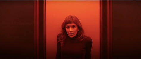
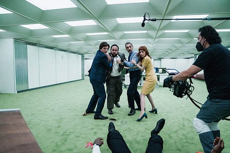
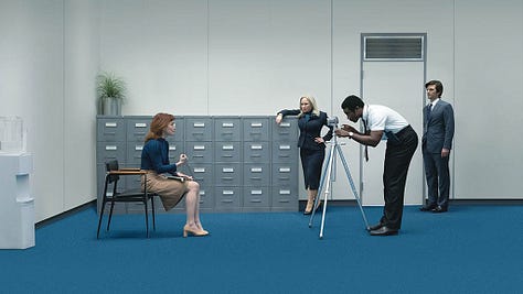
It reminded us of something artist Robert Henri wrote: “Color is only beautiful when it means something.”
Henri believed color should express something real. A belief, a mood, an idea..maybe a personality. It’s why Hopper’s paintings feel so emotional. The yellow glow of Nighthawks, IS human existence..loneliness, isolation, the feeling of sitting in a diner at 2 AM, alone together. That’s YELLOW here.
Filmmakers have borrowed from Hopper’s palette for years. The sickly greens in Taxi Driver, the orangy pink hues in Drive, the washed-out warmth of Her. None of it is random. It’s psychological. We’re seeing these characters in a different light. lol..walked into that one.



We’re getting at the fact that there is a lot we can do design-wise in real people life that is often reserved for cinema. Helly’s red hair and blue wardrobe against the green office isn’t just a nice color combo. It’s telling us who she is. She doesn’t belong in that environment. She stands out, fights against it.
Can we apply that thinking to real people interiors? Can we think about how a background palette or lighting scheme can change our perception of how we see ourselves or maybe how other’s see us? And Definitely how we feel at home.
We feel like most people don’t know themselves as well as a fictional character that was developed on a storyboard…and most Designers don’t bother to really get to know their clients to that extensive level of detail either. But maybe knowing weird details like their complexion color analysis..are they an Autumn or a Summer? IS important so the interior can support how they want to feel in their space. Their best.
A few months ago we wrote an essay called INTERIOR PHOTOGRAPHY IS STUCK, but perhaps Interiors themselves, not just the photography can take some cues from cinema and painting.
If a client sat in their living room, would they feel like the main character, lit and framed? Would the color of the walls bring out the warmth in their skin, the depth in their hair? Because it’s possible. We can curate these scenes in real life. We just don’t often do this because it feels risky. Cinema is play. But we can play too.
Last week we mentioned in the Project Spotlight section, how we were drawn to Darren Jett’s latest project. It had a story. It felt cinematic. The colors set the mood and it invited you to create a very vivid narrative for the person living there. How they dress, who comes over.. An interior can be a portrait.
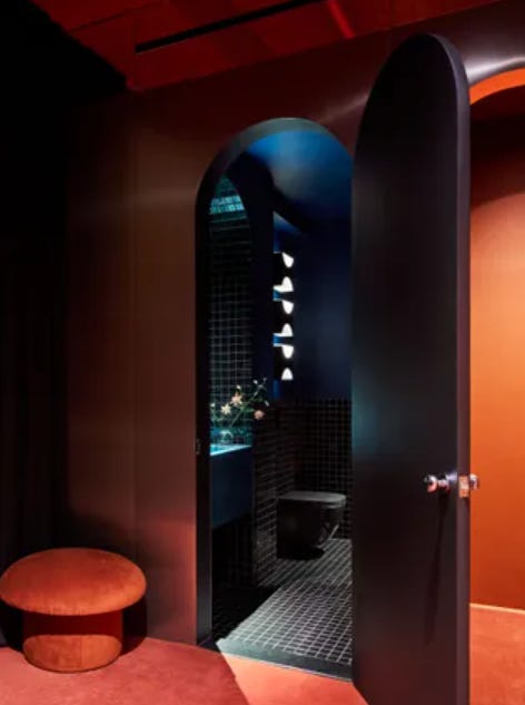
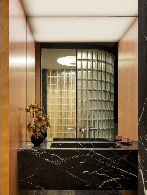

So..if we were painted in our homes, how would we look, what’s our essence?
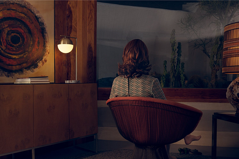
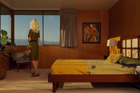
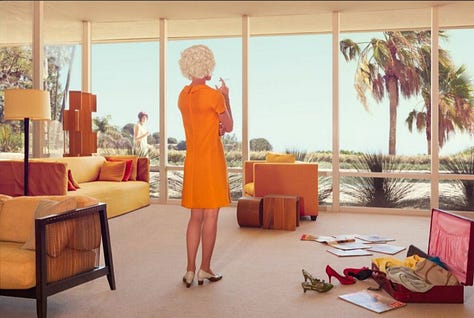
That’s all for this week’s random thoughts..For good measure..Check out Chloe Meynier (@chloemeynier) for some other cinematic-style photography we love.
Shop Where We Shop
Crimson Pulse…
Moodboard by: Cola Studios
Shop our selections below!
This timeless track-arm Tribute Sofa is a homage to the French designer Jean-Michel Frank, designed and crafted in the LA-based Soot design studio.
The Tera Mera Asmaan area rug is part of the Freedom Manchaha collection by Jaipur Rugs. Its design pays tribute to a desert plain, evoking nostalgia, symbolizing connection despite the distance, and reflecting the belief that loved ones remain united under the same sky.
The Ovoid Table coffee table is by British designer Cal Summers, who creates bespoke handmade furniture and objects that explore the beauty of materiality and form.
The Aluminum Scape Wall Light is designed by the contemporary Indian product design studio Stem Design. Handcrafted in India with meticulous attention to detail, each light captures the essence of the material, embracing its unique story and the inherent imperfections of the process.
This timeless 637 Utrecht Armchair, designed by Gerrit T. Rietveld for Cassina, features its original blue boiled wool upholstery with blanket stitching.
A highly unique and sculptural burlwood side table from the 1970s.
The Kansas Floor Lamp, designed by Luke Malaney, is an exploration of copper, with the lamp's shade shaped and patinated to resemble a storm-worn umbrella.
What’s Happening
What’s to see…
Gagosian presents an exhibition of paintings, a sculpture, and works on paper by Cy Twombly, featuring pieces never shown before and loans from the Twombly family, open across two floors at 980 Madison Avenue, on view until March 22, 2025.


I watched Desert Fury (1947) last night and every interior space owned and occupied by Fritzi, played by Mary Astor, was wonderfully thought out and full of muted colors. The film suffers from that "this is a night scene obviously shot during the daytime" syndrome that most older films have, but the treatment of the interiors as soft and distant from the desert landscape was fascinating to see.